


Colors in the home - the art of emotional harmony
Colors are one of the most important factors in interior design. They influence our emotions and mood and create the atmosphere we live in every day. That is why the thoughtful and correct selection of colors plays a crucial role in home decoration.
It is worth noting that each person perceives color differently - what is associated with peace for one person may evoke nostalgic memories for another. These individual emotional reactions create an interesting challenge for designers, as each color has a different effect in different interiors.
When choosing colors, it's best to listen to your own intuition, not just trendy advice. When you start arranging a space, keep in mind that the ultimate goal is to create an environment where you feel calm and comfortable.
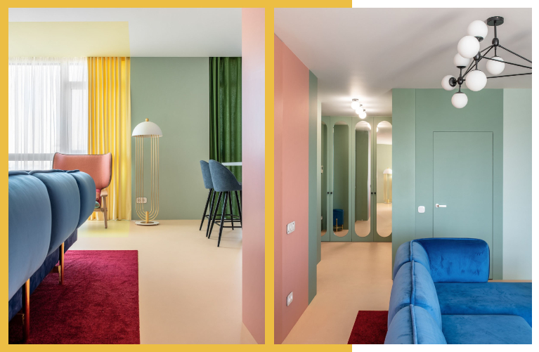
With the help of properly selected colors, it is possible to visually change the proportions of a room - to activate the space, compact it or, conversely, expand it. For example, a ceiling and one wall painted in dark colors add height and depth to a room, especially in narrow corridors.
All colors can be divided into three main groups:
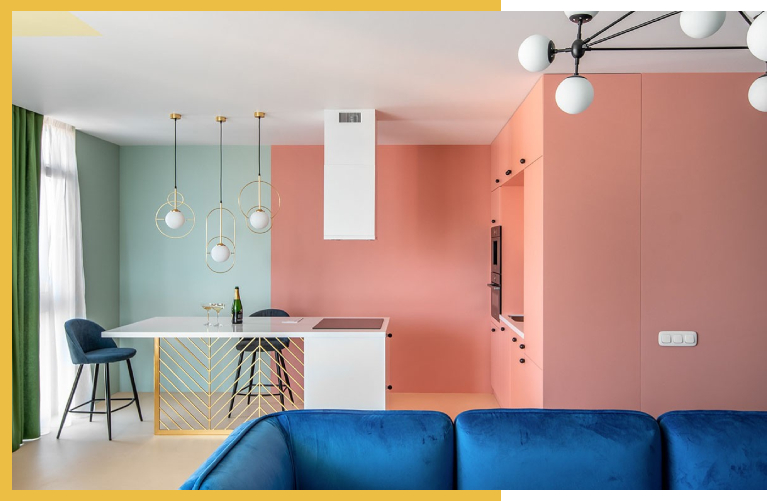
- Warm colors - these include red, orange, yellow and their mixed tones. These colors radiate energy and activity.
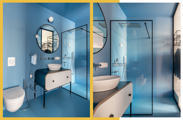
- Cool colors - blue, cyan, purple and green-blue tones promote calm and concentration.
- Neutral colors - white, black, beige and gray. They are often used as the main background and are ideally combined with other colors.
Neutral tones can balance out the color palette and maintain a sense of coziness in an interior. At the same time, they often help to cover up architectural flaws.
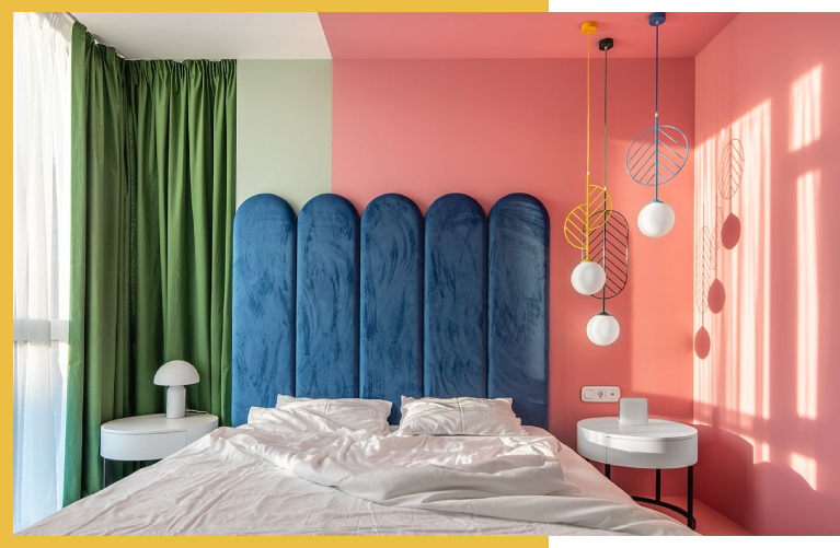
Color perception is significantly affected by lighting. The same color can appear completely different in natural light and under artificial light. Cool colors are often not noticeable in a dark space, while warm tones bring more life and energy to dimly lit rooms.
That is why, when planning an interior, it is necessary to consider the combination of lighting and colors - transparent colors work well in a bright room, while in a dark space it is better to use warm and deep tones.
Alpha Home 2025 - Sales Growth and a New Standard of Customer Trust
Successful sales and high standards for 2025
Why should you choose a large apartment? - "Alpha Home" offer only until December 31
Choose a large apartment in Alpha Home and receive 25-30 sq m as a gift
Payments, deadlines, documents - everything in one panel
All important information about your apartment in one space
Modern fire standards in Georgia - automatic sprinkler system and Decree 41
Decree 41 and the automatic sprinkler system – the most reliable guarantee of the safety of your apartment
"Skhva Ubani" - a new standard for commercial spaces in Didi Dighomi
Residential space in Didi Dighomi is becoming increasingly popular, but "Alpha Home" is not like any other neighborhood.